For posterity’s sake, I’m both going to refer to my earlier reply in your continuation thread here, and provide additional responses in this thread. I appreciate these questions and feedback.
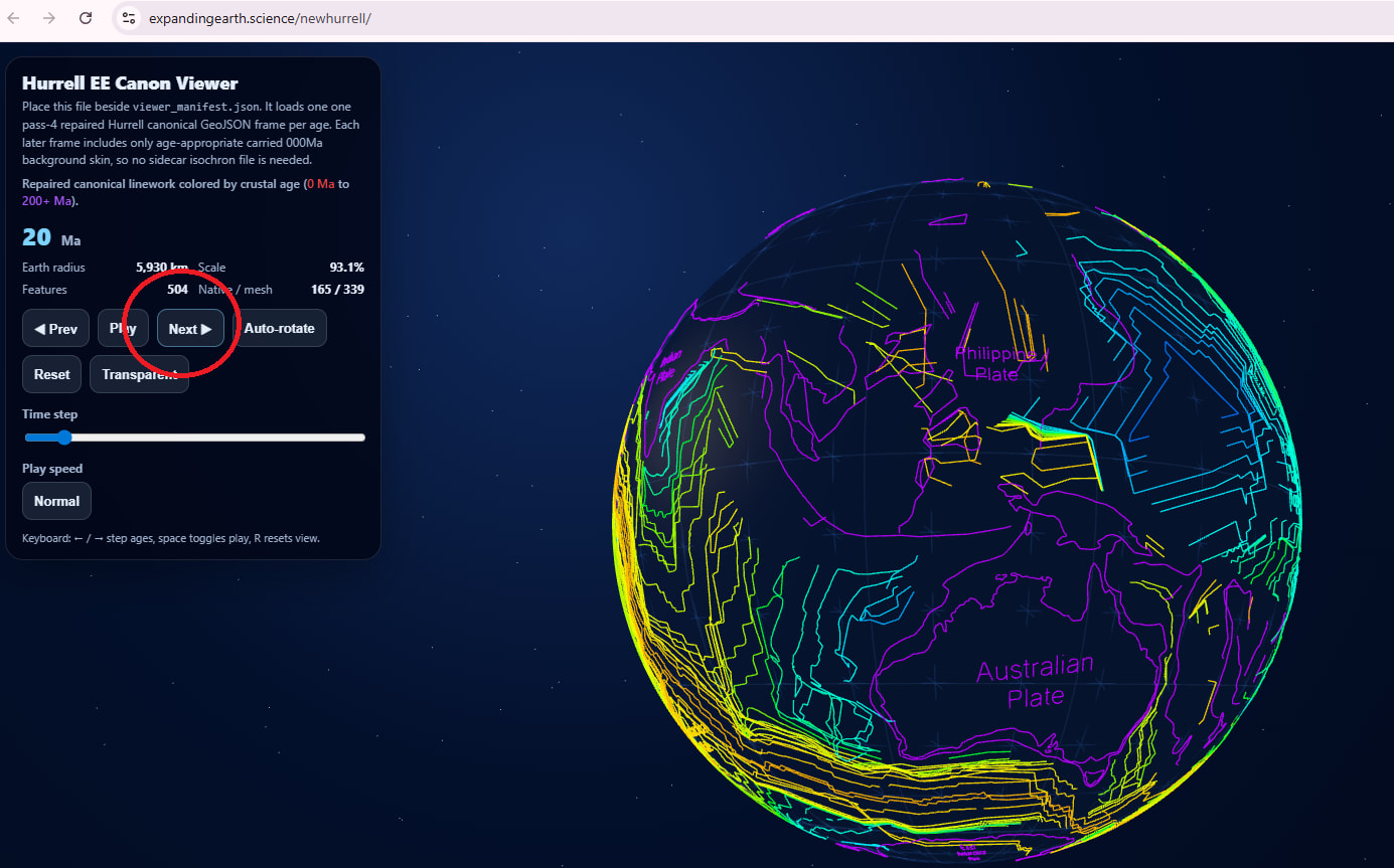
>First - what is that viewer you’re using for the Hurrell models?
Ask ChatGPT to write you an index.html file that contains a 3D globe viewer using the JS globe package, then get a cheap hosting package, are my suggestions.
You can use that index file to drape image files, GeoJSONs, meshes, and much more. You can try running it locally, but you may run into firewall issues trying to run certain scripts. It’s a surprisingly small file, but I think that’s because it pulls from other packages online (hence the firewall issues).
I have used Blender in the past, and AI walked me through that process and wrote the script for it, but most of what I’m doing is using a command prompt window and Python. Either way, once the material is created, you update the index file nomenclature accordingly.
>Can you freely move the different features? That’s very cool, I’d love to try it.
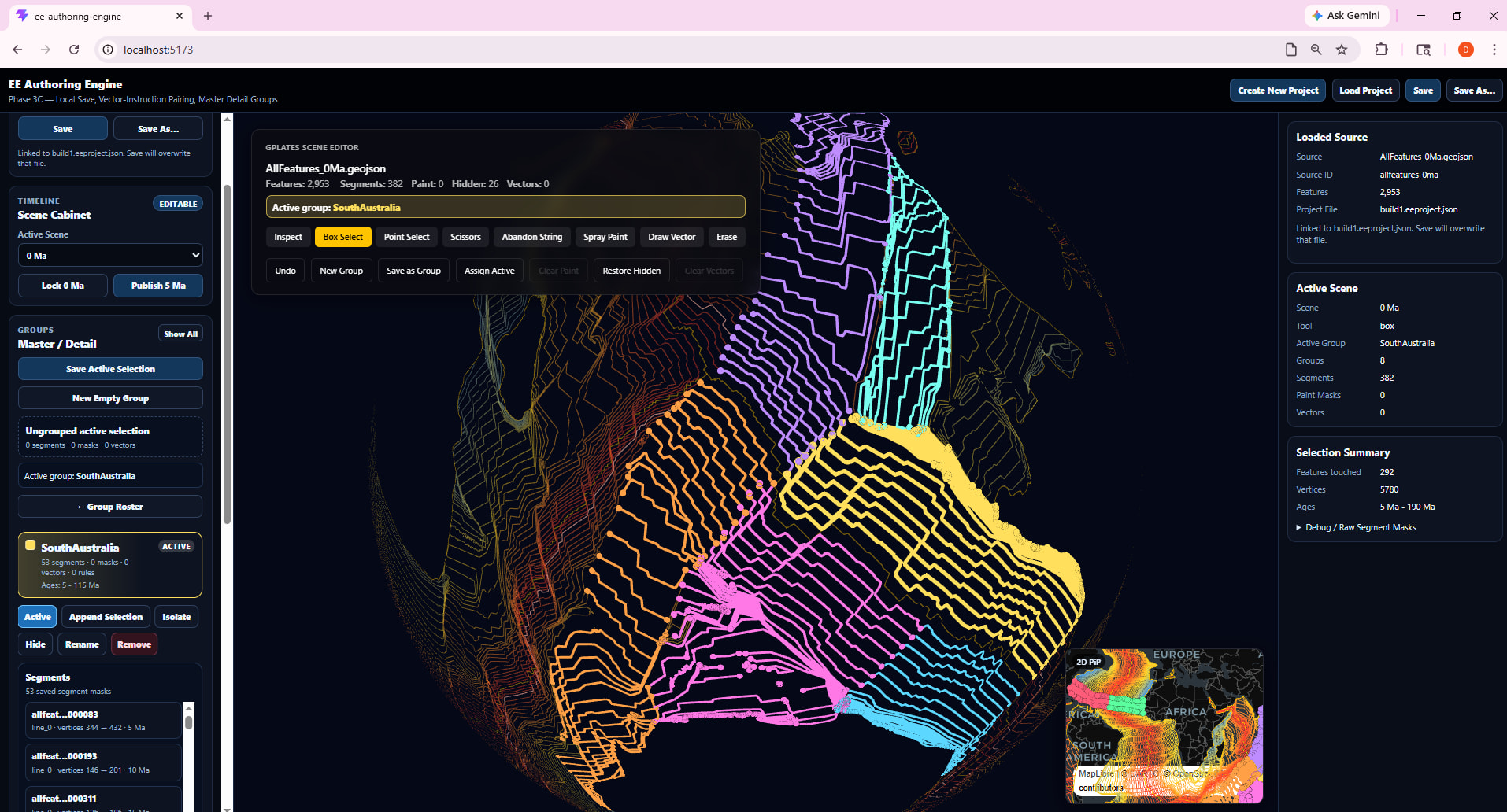
This is just a viewer. And, since I’m using GeoJSON files to depict the surface features, no. Based on how those files work, I know you cannot edit or manipulate them in real-time. You just have to process new GeoJSON files.
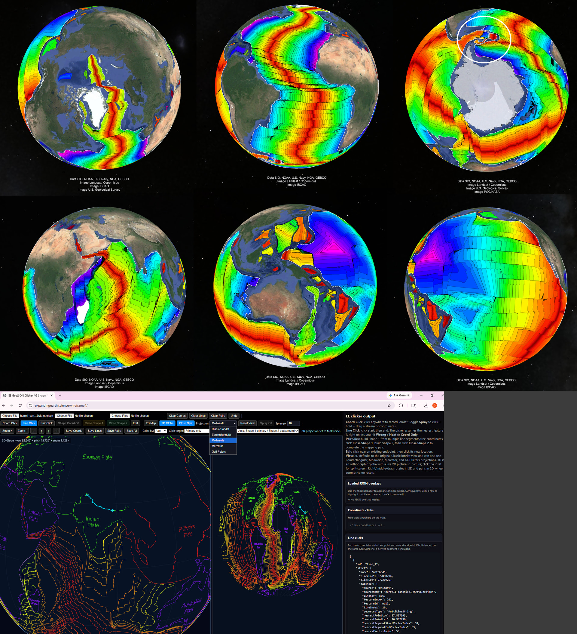
If you go to the site’s directory (forward slash) wireframe3, you will find a viewer that has some interactive tools with which you can easily plot, match, and export coordinate sets (produced as JSON files) with associated feature ids (optional, linking to specific GeoJSONs). I say easily, but there’s a learning curve to figuring out the buttons.
I’ve never tried asking ChatGPT to incorporate a free movement tool for image files or JSON files (coordinate files, but much simpler), so I’m not sure, but I’m continually surprised by how many cool things you can build for free in minutes, if you just think or know to do it.
The viewer does have kinematics built into it, and although I think you saw this, I’m including a screenshot as a mini-tutorial/plug for those potentially interested in trying it out. Note that you can deselect the Transparency feature (the button is called “Solid”).
For attribution purposes, I should mention that the above is a fusion of my AI’s derivation of the Hurrell coordinates (from file on his site) and a seafloor isochrons GeoJSON file that my AI built from the Mueller 2019 dataset available on Earthbyte’s website.
Hurrell’s files were written for a very old computer program that requires an emulator to run. Some features were lost, based on intractable nomenclature issues, so I supplemented his material with the Mueller data and had AI try its best to approximate their positions at subsequent time frames.
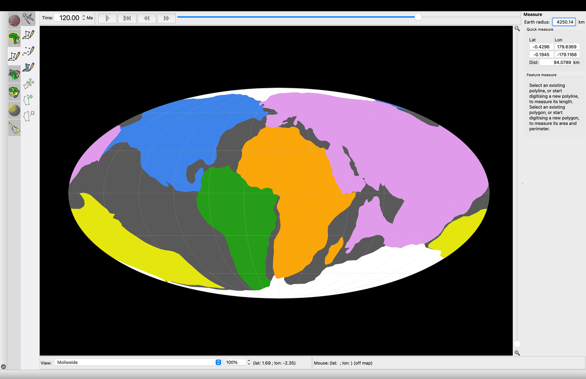
>Here is 110ma small Earth compared to a fixed Earth with the same isochrons in the same configuration
As mentioned in my other reply, there’s a size/scale issue that one has to deal with when working with a variable-sized earth. This only comes up in your gif in the other thread (which is very cool), because I think it’s dealt with by the changed globe size in your still screenshots.
Namely, when you use the Globe.JS package, the software assumes that the radius is 1. Everything is programmed relative to that. So, when the script “shrinks” the globe in the user interface depicted in the screenshot above, all of the surface features will shrink with it.
You need to take this into account when you do this kind of modeling. In your gif, this would be achieved by having the continents get continuously larger (see Hurrell’s 200 Ma depiction @ ibb DOT co FORWARD SLASH ch5zdzYM).
I built a proof-of-concept model found at the (forward slash) terrain2 directory, to establish that my ChatGPT does have the ability to model in 2D a scenario where, in 3D, there is a solid surface that breaks apart into polygons, which spread apart and leave “oceanic crust” in their wake between them, and simultaneously adjust the radius of the globe and the depiction of the polygons according to a certain radius schedule. The hard part is getting it to do this with the very complex real-world data.
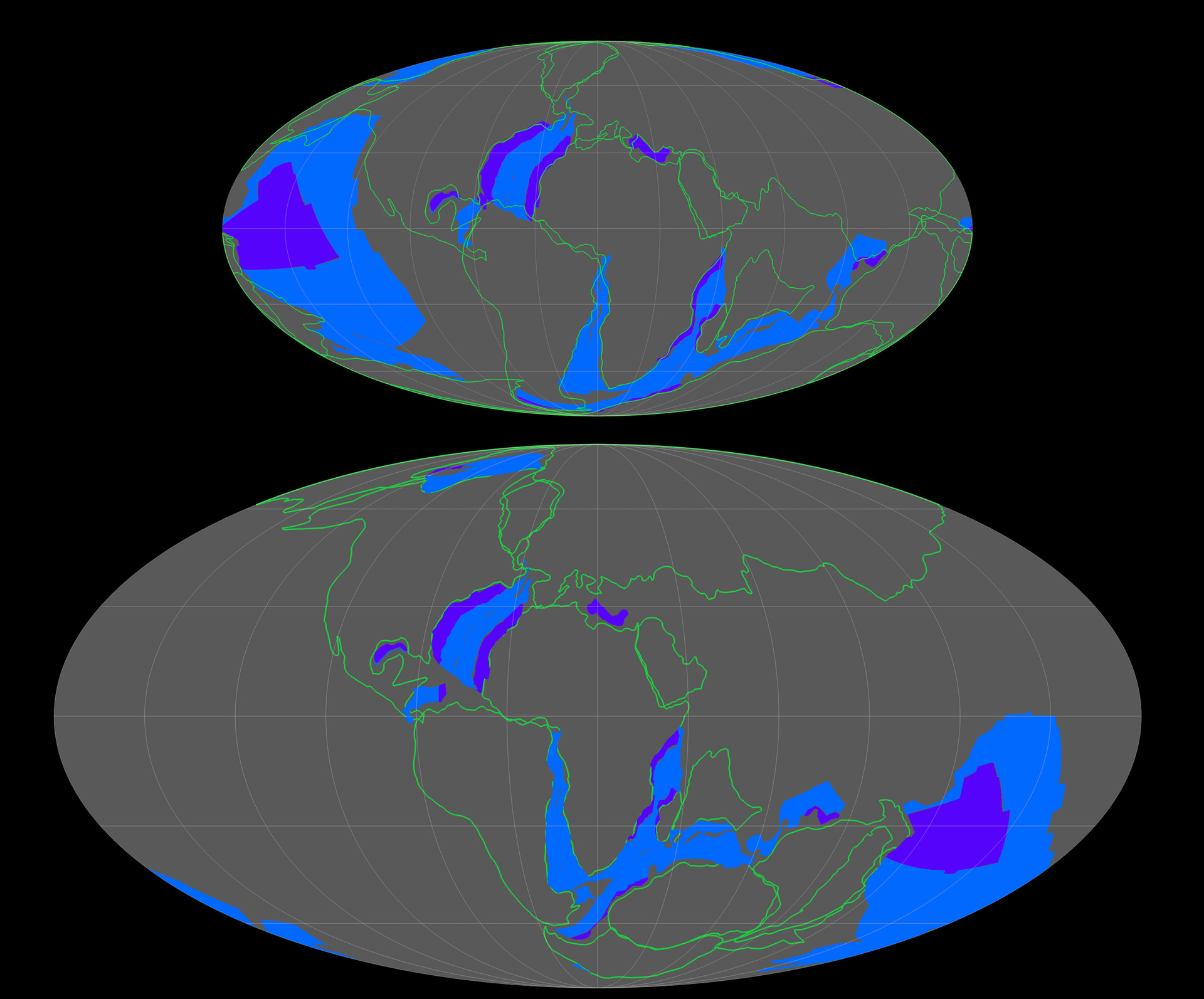
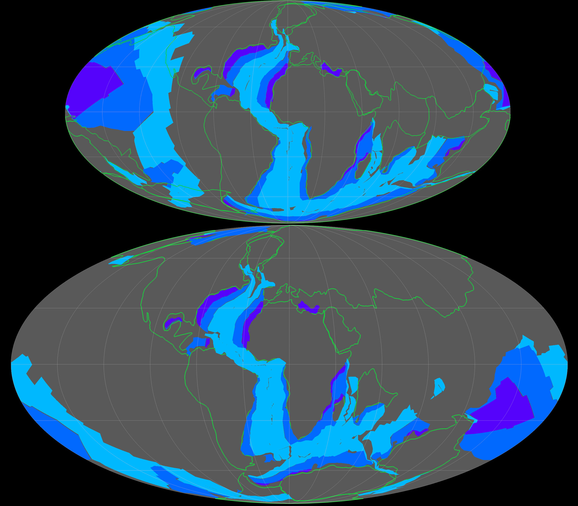
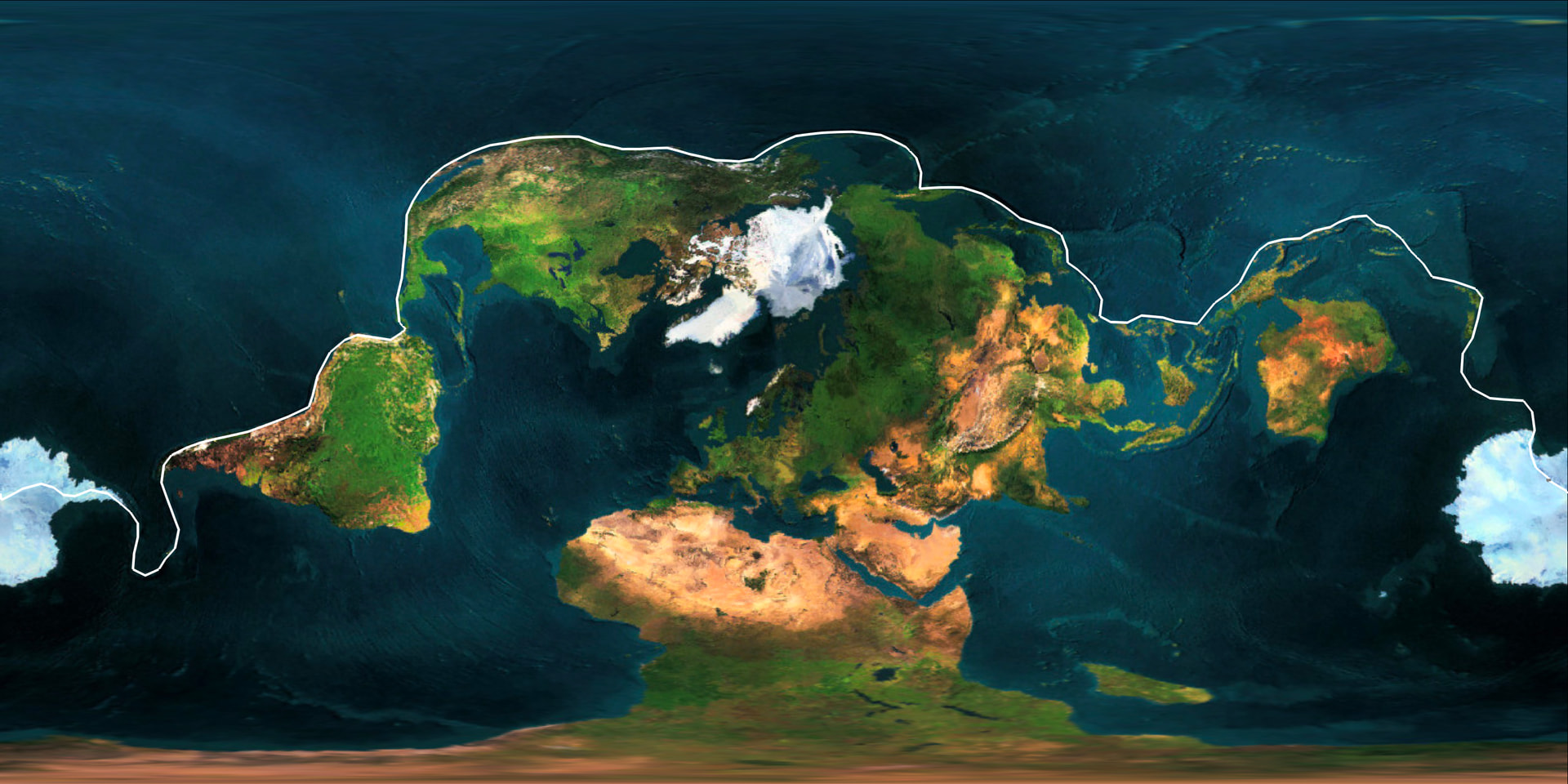
Some related last thoughts, I discovered (by clicking individual points around it in Google Earth) that you can draw a line around virtually all of the Earth’s continental crust (save Madagascar) without picking up your pencil.
In this screenshot (image), the white circle represents the lone “cheat” I used–a 20x50km patch between the tail of South America and the West Antarctic peninsula where the continental crust bridge has broken– to keep this as a continuous line around all of the continents. Australia is connected to Asia by continental crust, it’s just submerged.
There’s no reason why, in the plate tectonic model, all of the continental crust should be connected. It isn’t connected before Pangea, and it’s scheduled to break apart in the future (under both models). This just goes further to show that the continental crust was, at one point, the outer shell of a smaller globe, in a lid tectonics state.
It has cracked apart and is spreading open primarily in the Southern Hemisphere. If you view the isochrons top down from the North Pole versus from the South Pole, this becomes glaringly obvious. I wonder if there is a way to establish that this phenomenon only occurred once.