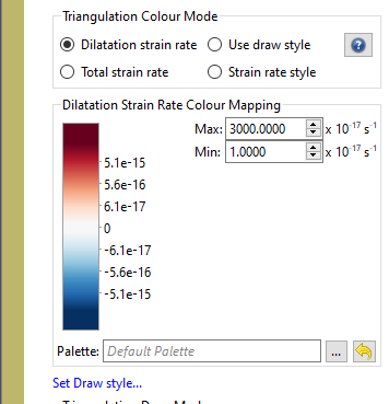
I was just looking at changing the colour map for dilatation strain rate on a topological network but I noticed that the colour min/max settings would disappear whenever I imported a palette outside the default one. The result being that the colour map would be stretched over a completely useless value range. Is there something I’m missing here?
While I’m at it, is there any intention to change some of the inbuilt default colour palettes? I’m particularly looking at the ugly rainbow maps that come up as default for a lot of features. It would be nice to see some more perceptually-uniform options inbuilt.
Have you tried to generate a cpt file for the same value as displayed for the default palette?
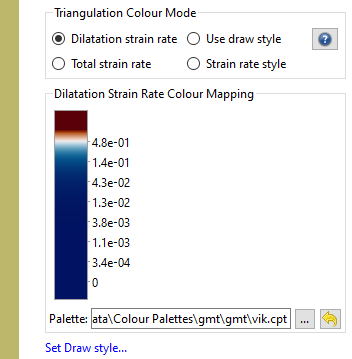
This could be a quick fix, although not quite convenient. GMT6 has for example the vik colorpalette built in and it would be a quick call to makecpt to generate a new palette file with the strain rate values displayed in the default GPlates colorpalette.
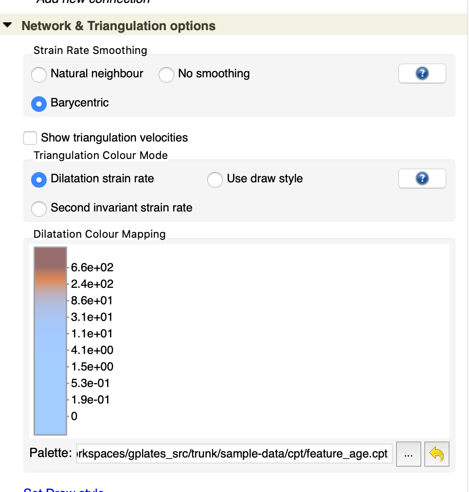
By the way, there are perceptually uniform inbuilt palettes for the raster, 3D volume and scalar coverage layers…
…however for topological network layers it’s more tricky. Turns out it’s better, for strain rate, to distribute the display of the colour scale uniformly in ‘log’ space. In linear space it just looks skewed when visualised on the globe (ie, most of the colour variation is squashed into a small strain rate space). Also when you have positive and negative values (strain rate extension/compression) you cannot display a uniform-log palette across zero because, in log space, you cannot reach zero. But you can get near zero, which is what the default palette does.
Because of all this, it was difficult to remap user-provided palettes (as is done in the raster, etc, layers). So when you create your own colour palette you pretty much want to (1) work out the individual colour slices in the palette such that they’re spaced uniformly in log space, and (2) attach reasonable strain rate values like in the default palette (like Christian mentioned).
Also the default dilatation rate palette is perceptually uniform (it’s a blue/red ColorBrewer palette). We chose red/blue as this is commonly used for extension and compression.